The Dimagi Blog
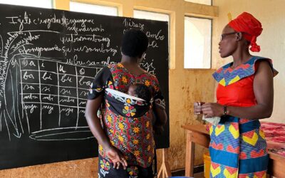
This case study, originally featured in Philanthropy Impact Magazine (page 16), is complemented by the above image, courtesy of Taking Pictures, Changing Lives Foundation. "Now that I can read, I was elected as a women’s representative in our community. I also...
The Case for Frontline Worker Resilience Frontline workers are the backbone of essential services worldwide, often operating under pressure with limited resources. In Low- and Middle-Income Countries (LMICs), burnout among frontline health workers is driven by several...

Recent budget cuts across international development have created an unprecedented challenge for program teams worldwide. USAID alone has seen over 80% of its funding cancelled, forcing implementing organizations to do more with dramatically fewer resources. Teams that...
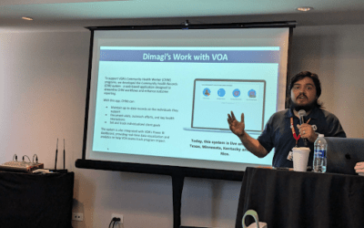
AmeriCorps Community Health Worker Jesus Nieves speaks to Dimagi staff in Puerto Rico, March 2025 Volunteers of America (VOA) is one of the nation’s largest and most established human services organizations, reaching more than 2 million people annually across 47...
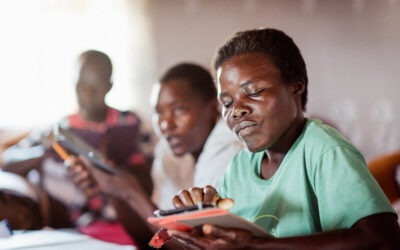
Introduction Frontline health workers (FLWs) play a critical role in increasing access to health care and health information in low- and middle-income countries (LMICs). However, many FLW programs face resource constraints around training, supervision, and coaching....
On January 20th, the United States government announced the start of a USAID restructuring that has since had a significant impact on the global development industry. In the immediate term, our focus is on supporting our partners as they navigate new challenges. Here...

As we step into 2025, the world of global health and development faces an increasingly uncertain and complex landscape. We don’t know what new challenges 2025 will bring us, but we are clear that the need for essential services continues to grow and funding continues...

Our Founding Our journey began in 2009 when a group of innovative researchers at the University of California San Diego embarked on a groundbreaking journey. Collaborating closely with tuberculosis programs in California and Baja California, Mexico, they pioneered the...

Scaling Digital Health Across Africa In October 2024, Dimagi hosted our inaugural CommCare Government Summit in Addis Ababa, Ethiopia, an event that brought together 64 health leaders from 11 countries to explore opportunities to scale digital health solutions in...

Dimagi is excited to participate in the upcoming Global Digital Health Forum 2024! As a leader in innovative digital solutions for global health and development, we’re thrilled to showcase our work across eight diverse sessions. Each year, Dimagi team members share...

Cambridge, MA, November, 2024 – The United States Agency for International Development (USAID) Development Innovation Ventures (DIV) program has awarded Dimagi a grant to scale and evaluate its innovative CommCare Connect (CCC) platform. This partnership aims to...

In September 2024, more than sixty members of our Global Tech Division (and some guests) traveled to Platja d'Aro, Spain to meet once again. It had been two years since many of us had seen each other. Twenty percent of us had never traveled to Europe before and some...